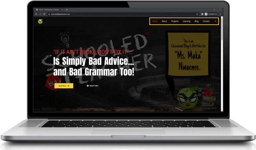
I’m currently in the process of taking my ePortfolio from builder-grade basic to one that stands out from the crowd. After trying to figure out how to create an ePortfolio that will get me noticed, I concluded that one of the things I would have to do is take some time to learn about design.
So, I did just that! I hunkered down with a cup of green tea, turned on an upbeat study music playlist and used a couple of well-spent hours learning about basic design principles.
Now as I take survey of how things have come together a few weeks in, I can honestly say that the time I spent early on learning about the fundamentals of design has made a significant difference in the overall look and feel of my ePortfolio!
So, I wholeheartedly encourage you to take a bit of time to learn about design as well!
It’s not as hard as you might think, and I’ve made it easier because in this blog post, I’ll share the top 10 design tips that I came across as I work to revamp my ePortfolio.
So whether you’re a student or a professional, read on for some helpful design tips for a standout ePortfolio!
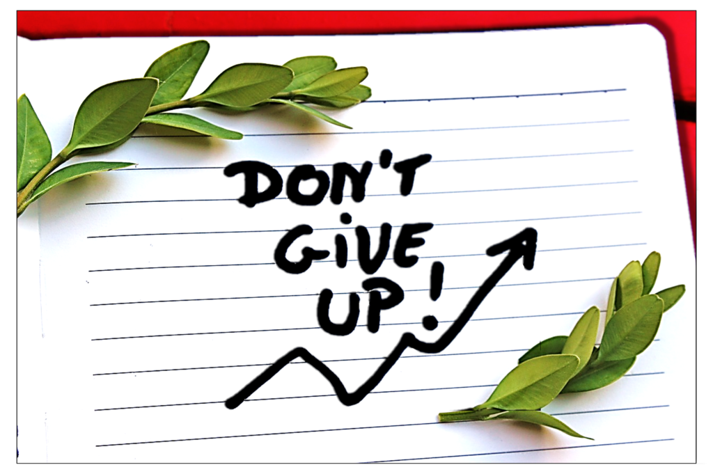
Tip #1: Be patient and don’t give up!
Building a standout ePortfolio is like growing a tree: it takes time, patience, and a good deal of hard work. And just like with a tree, there will be times when the branches might not grow as fast as you want them to, or the leaves might not be as green as you thought they would be. But don’t give up! Just keep watering and pruning, and eventually you’ll see results.
Now that we’ve got that healthy dose of ePortfolio motivation out of the way, lets move on to some more practical tips…
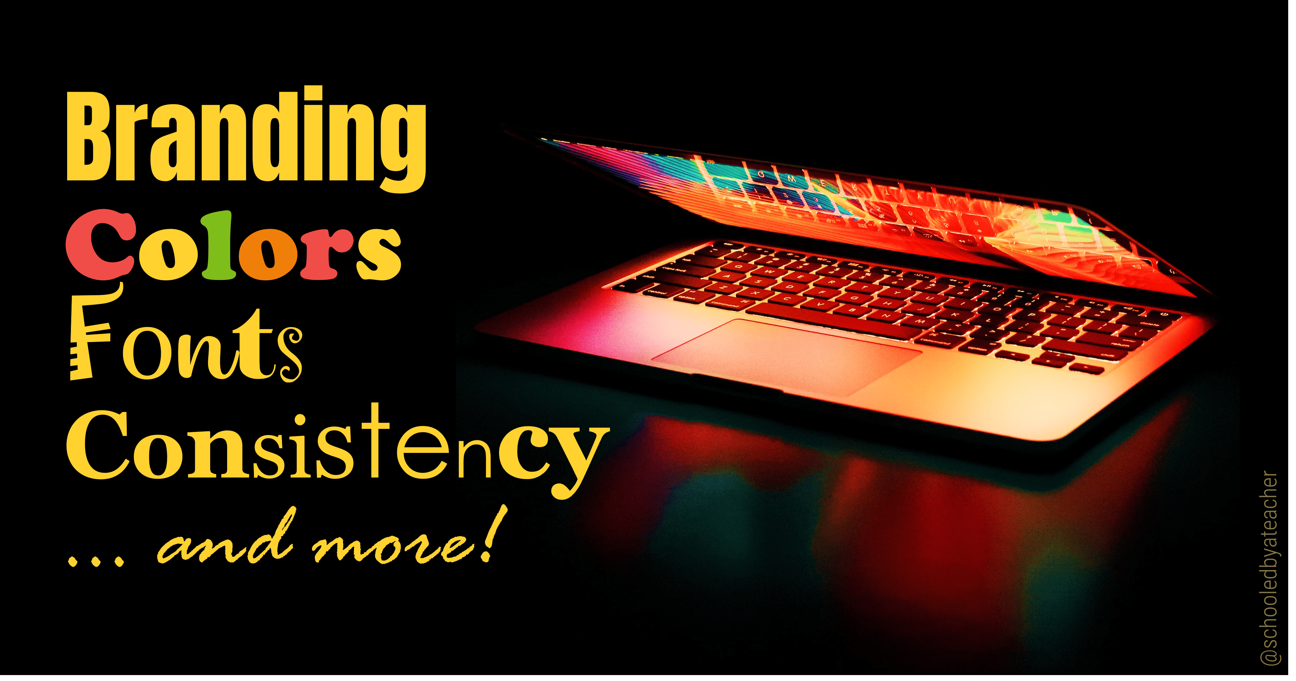
Tip #2: Consistency is Key
As you develop your ePortfolio, it should have a consistent look and feel throughout. This means using the same fonts, colors, and overall style on ALL the pages on your website.
Why does this matter? When all the elements of your ePortfolio, such as the fonts, colors, and overall design, are consistent, it creates a sense of cohesion and makes your work easier to scan and digest. This is especially important when you are applying for jobs or internships, as you want to make the best first impression on potential employers.
Having a consistently designed ePortfolio also gives you a sense of control over your online presence, a.k.a. your personal brand. Your brand might be simple and minimalistic or bold and eclectic. It could also be informative and scholarly or playful and creative (or a unique mixture of these styles).
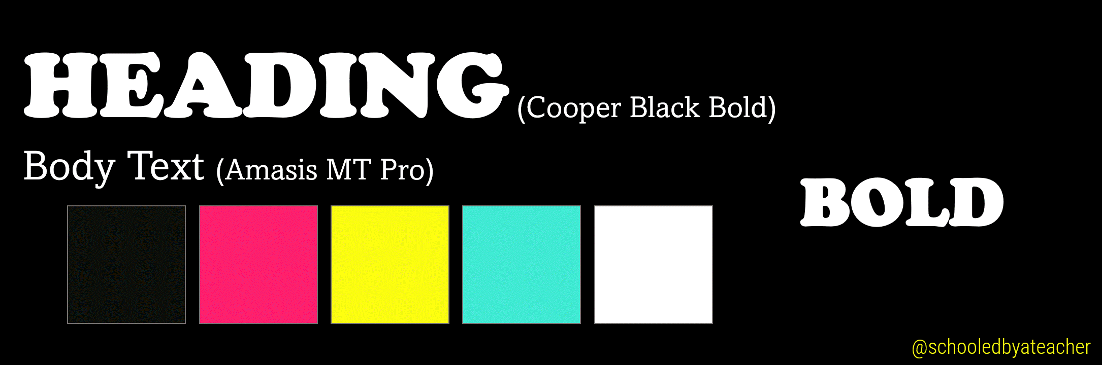
No matter which way your personal brand leans, the fonts, colors, and overall design you choose should adequately and consistently convey who you are and reflect the skills and abilities you bring to the table.
💡Bonus Tip: To further establish your brand and make you recognizable, the style you use on your ePortfolio should be carried across other networking platforms you belong to.
Tip #3: Color is powerful. Use it Wisely!
When designing your ePortfolio, be very intentional with your choice of color. Color choice is crucial because it can have a huge impact on the way your audience perceives and interacts with your content.
For example, using specific colors can:
- elicit a positive or negative response
- pique attention or curiosity, or convey blandness or a lack of effort
- help guide your audience’s attention to certain areas of your ePortfolio while detracting it from others.
Keep in mind that there are several other factors that affect how people perceive and react to colors. This includes the color’s shade, tint, tone, or saturation. It also includes how colors are paired with other colors or shapes, or even the message attached to a specific color!
But overall, what I learned is that it’s important to choose a limited color palette (think 3 – 5 colors) that will help create a cohesive look for your ePortfolio. This is because using too many colors can be overwhelming and distracting and can create a sense of dizzying disarray and disjointedness.
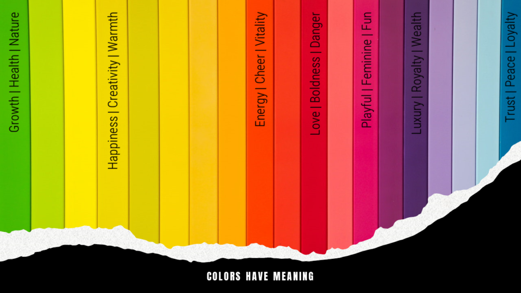
So, think about the message you want to convey to your audience and the mood you want to create. Then, choose colors that will help you achieve what you envision, and don’t be afraid to experiment.
By the way, if you need inspiration, here are three free color palate generators that can help you with selecting cohesive colors for your ePortfolio:
Tip #4: Use Fonts and Typography Effectively
A font is a set of text or characters with a specific design. This includes letters, numbers, punctuation marks, and other symbols. Put simply, typography is the art of arranging text and characters to create visual communication. Both font choice and typography are important elements to consider while building your ePortfolio because they will affect the readability, legibility, and overall aesthetic of your website.
With this in mind, fonts should be used to create a sense of visual hierarchy or importance for the content in your ePortfolio. For example, you should consider using a larger, bolded font for your titles and headlines and a smaller, but readable font for the body text of your ePortfolio. If you scroll through this post, you will notice how I used font size to create visual hierarchy.
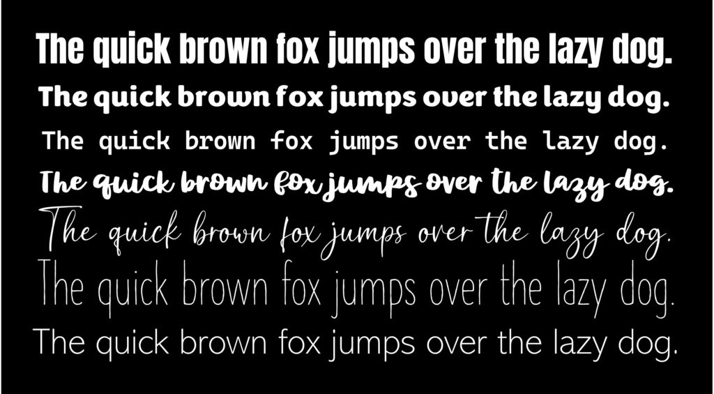
Fonts and typography can and should also be used to convey emotions and create a mood within your ePortfolio. For example, a bold, all-caps font placed at the center of a page might be used to create a sense of excitement or power, while a more delicate, cursive font aligned to the left might be used to create a sense of calm or serenity.
By choosing the right fonts, sizes, and colors, and positioning your text intentionally, you can create an ePortfolio that is easy to read, visually appealing, and consistent with your overall brand identity.
Here are three websites that can help with visualizing how font pairs work together:
Tip #5: Make Your ePortfolio Easy to Navigate
A website that’s hard to navigate is like an overcomplicated maze: you might eventually find your way out, but it’s not going to be fun trying to find your way around.
Use clear and concise navigation menus and titles so that people can easily find the information they’re looking for in your ePortfolio, and make sure your pages are easy to find. The easier it is for people to find what they’re looking for, the more likely they are to stick around on your ePortfolio and learn more about you and what you have to offer.
Additionally, use keywords and phrases in your page titles and descriptions so that people can quickly know that they are on the page they are looking for or easily find your pages and posts when they’re searching for information online.
Tip #6: Organize your content.
This is an off shoot of points three and four, but please make it easy for viewers to find what they’re looking for by organizing your content in a logical way.
Use clear, large, and bolded headings and subheadings and provide navigation tools such as a table of contents or search bar. These tools will help visitors to your ePortfolio quickly access content they want to see without the hassle of sifting through items they would rather not.
Tip #7: Use Negative Space
Negative space, or white space, is the area around the textual or visual content of your ePortfolio. Consider negative space to be like a good friend: it’s always there for you, but it never gets in the way!
Use negative space to create a sense of balance and harmony. For instance, you could use multiple negative space areas to balance out a large block of text. This could prevent reader’s fatigue, particularly on cellphones, if your ePortfolio includes blog entries like mine.

Furthermore, use negative space to create a sense of focus and emphasis. For example, you could use a negative space area to surround a photo or a key piece of information, such as your contact information or a call to action.
Tip #8: Use High-Quality Images and Videos
Images and videos can be a great way to break up text and add visual interest to your ePortfolio, but don’t make your visitors squint to see your images! Use high-quality/high-resolution ones, so they can appreciate your work in all its glory! Also, make sure your visuals are relevant to the content you’re sharing!
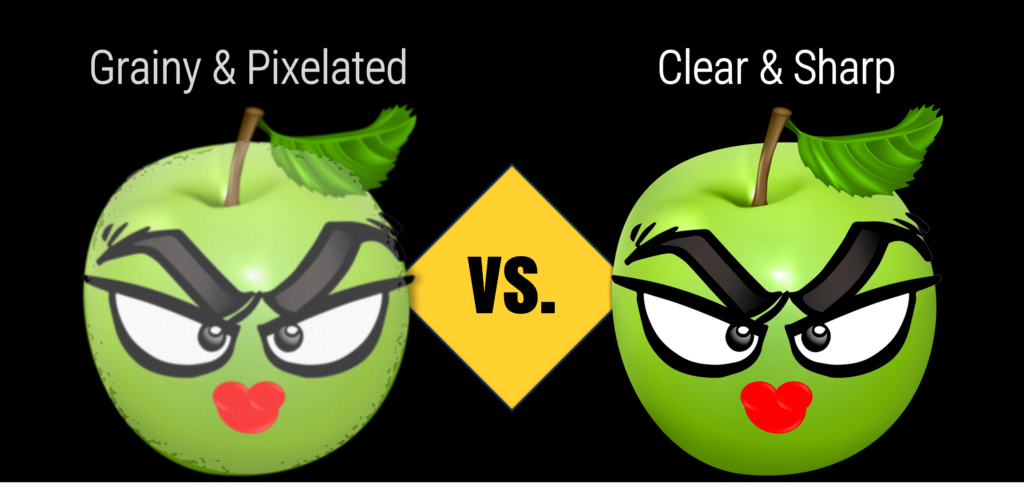
When someone visits your ePortfolio, one of the first things they’ll notice are the pictures you have up. If your images are blurry, pixelated, oddly cropped, or poorly lit, it will give a bad first impression of your work. High-quality images, on the other hand, will show that you are serious about your work and that you take pride in your presentation.
Likewise, images can be a fantastic way to showcase your skills and talents to whoever visits your ePortfolio without using words (showing vs. telling). Again, use high-quality images of your work, or you in action, to show your teacher/professor, potential employers, or clients what you are made/capable of.
Afterall, anyone can concoct up stories about all they’ve done, but having high-quality visual proof gives an extra level of credibility and authenticity to your claims.
Tip #9: Create a Responsive, Mobile-Friendly Design
A responsive design means that the contents of your ePortfolio automatically adjusts to the size of screen it’s being viewed on. It is extremely important to verify that your ePortfolio looks good and functions properly on all commonly used electronic devices. *This is especially true for cellphones.
More and more people are viewing ePortfolios on mobile devices. So, while you are working on your ePortfolio, take the extra step of clicking on the three different responsive view options (desktop 🖥️, tablet📱 and mobile🤳) and make sure your ePortfolio is optimized for mobile viewing. This means all text is legible, no text is cut off, pictures are within view, etc.
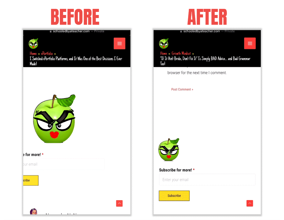
Here is an actual example of an adjustment I had to make with my own ePortfolio. As you can see, the gif and the subscribe box on the left were not positioned properly, so I went into the backend of my WordPress and adjusted the image padding and margins for the mobile view only. This took me less than three minutes to figure out.
A key takeaway I want to reiterate is that your ePortfolio should be accessible to everyone, regardless of their device. If your ePortfolio isn’t mobile-friendly, you could potentially be missing out on a huge audience. So, make sure to optimize your ePortfolio for mobile devices so that everyone can view it, no matter what device they’re using!
💡Another Bonus Tip: Add a QR Code or short link that leads to your ePortfolio to the top left or right corner of your resume, business card, email signature, etc. to boost traffic to your website in an organic way.
Tip #10: Be Yourself…
As cliché as it might sound, be yourself! None of these design tips will work if your ePortfolio does not reflect the real you in the most positive way possible!
So, take a long look at your current ePortfolio and ask yourself, “does what I have created reflect who I am and the brand I want to be associated with? Does my ePortfolio reflect excellence, or is it a showcase of mediocrity? If a potential employer or business partner were to Google my name, and my ePortfolio popped up at the top of their search results, would I be proud of what they see?”
If you ask yourself those tough questions, and you are satisfied with the answers, then congrats! You are well on your way to achieving the goal(s) that align to the reason why you created your ePortfolio in the first place!
But… and this is a BIG BUT… if you are unsatisfied with the way your ePortfolio looks, or if you are still in the planning phase of your ePortfolio or looking to revamp your ePortfolio, think deeply about who you are as a person; your skills, talents, values, likes, and dislikes. Think about your favorite colors or colors you can’t stand (I personally can’t stand pink). Then, consider the design style you would like to use to bring who you are, within the confines of your ePortfolio, to life! Would that be minimalist, maximalist, bold, edgy, modern, sophisticated, playful, earthy, futuristic, vintage or some other style?
After doing this, I strongly suggest looking up other ePortfolios or websites that fit the vibe you are trying to create in your ePortfolio and comparing what you see to the vision you have for yourself and your ePortfolio.
If both of those things align, begin creating your own standout, one-of-a-kind ePortfolio design!
Use all the tips you’ve learned here today, along with the Top 5 Content Tips for a Standout ePortfolio, and as things come together, you will be so proud of what you’ve created!
If you’ve found this helpful in any way, please consider leaving a comment below!