Although I’m relatively new to the ePortfolio game, I’ve already created not one, nor two, but THREE different ePortfolios! Whether you are an ePortfolio newbie like me, or a seasoned pro, I’m sure you can imagine creating an ePortfolio is no easy task… let alone three!
Click here for 10 Design Tips to Elevate Your ePortfolio to the Next Level!
I’ve always been a bit of a creative tech-head, so when I decided to put together an ePortfolio, I wanted to use the best platform possible.
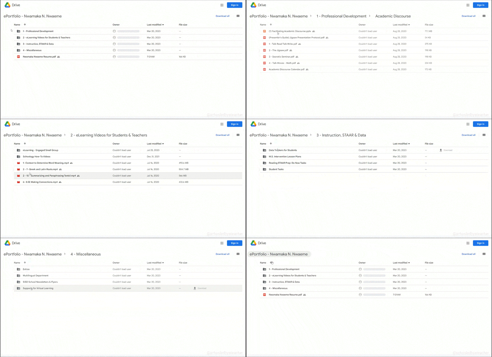
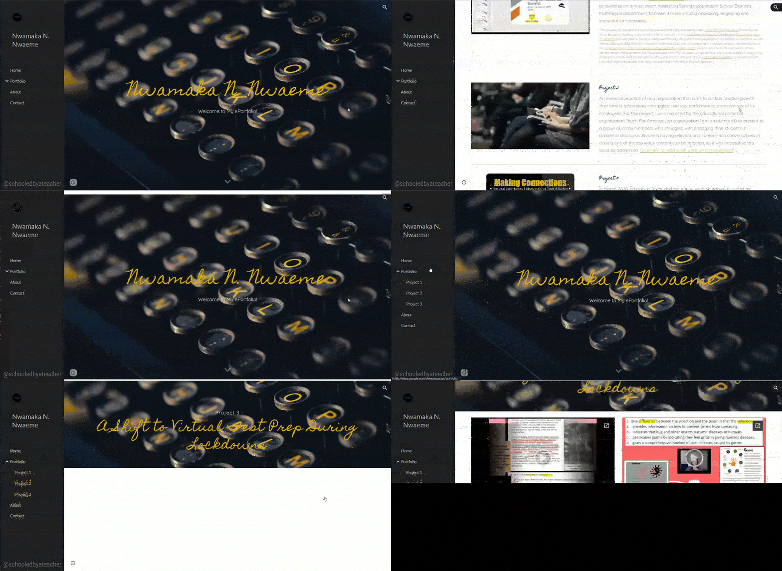
I started out using Google Drive… Umm… yeah… This was a clear and brazen contradiction of the earlier paragraph, but I really thought I was being fancy with all my organized folders and files. A few years later, I moved on to Google Sites… a couple of steps up from Google Drive, but another contradiction (and one which I quickly abandoned). My third and current ePortfolio is presently being constructed using WordPress. Yes, it’s still under construction, and will be so for the foreseeable future, but I think I’ve found the right platform, and my ePortfolio is looking better than ever!
I’m going to break down my thoughts on the three ePortfolio platforms that I used, and I am also going to provide you with a rating on a 5-star scale in the hopes that it makes creating an ePortfolio much easier for you than it was for me!
Table of Contents
ToggleGoogle Drive: A Digital Filing Cabinet and Not the Best Place for Your ePortfolio
My first ePortfolio was merely a Google Drive folder that neatly categorized/organized my work artifacts into a subset of more folders and subfolders.

Google Drive is a trademark of Google Inc. Use of this trademark is subject to Google Permissions.
There was a rhyme and reason to these folders and subfolders, but it was ultimately a selective dumping ground for my work instead of a place that told a story about who I am as a person and an educator. It also failed to adequately show what I have to offer to the world at large, my community of fellow educators and even prospective employers and business partners.
I cringe at the fact that I included a link to my Google Drive ePortfolio on my resume by the way. It was literally like giving a potential employer a filing cabinet and saying, “here, sift through these dusty files! I hope you find something you like!”

And let’s be realistic; which hiring manager or recruiter is going to sit there clicking through files when they are hard-pressed for time and likely have other candidates with more engaging ePortfolios linked to their resumes?
Although Google Drive is a great place to store your files, it’s not a good place for your ePortfolio. Here’s why:
- It’s not designed for ePortfolios. Google Drive is designed for storing files, not for creating and managing a website, which is what your ePortfolio should be. This means that it is missing nearly all of the features that you need to create an ePortfolio.
- It’s not customizable. Google Drive doesn’t give you any control over the look and feel of your ePortfolio. You are limited to folders and files. That’s it! Zzzzzzzz… boring.
- Managing access to your ePortfolio content can be a slippery slope. Since you must grant viewers permission to view your files, you must remember to either remove or keep the option for viewers to be able to edit, download or make a copy of your content. You definitely do not want to head to your ePortfolio one day and discover that a file has been deleted or edited without your permission. You also never want to receive an email requesting permission to view a file from a prospective employer (but chances are they would have already moved on to another candidate instead of going through the hassle of contacting you)!
- A Google Drive ePortfolio is a missed opportunity. It is a missed opportunity to showcase your skills and the quality of your work and have it on display front and center. It is also a missed chance to show the active and deeper learning you might have engaged in as a continuously growing professional.
Final Verdict – ⭐ (You will always be my baby though)
Google Sites: More Powerful Than Google Drive, But Still Not Good Enough

Google, Public domain, via Wikimedia Commons
Right off the bat, I want to give Google Sites the props it deserves; it is a pretty good tool for creating a simple and free ePortfolio or website. When I upgraded my ePortfolio to this platform, I truly was making moves in the right direction!
Google Sites is a basic, drag and drop website builder that is extremely user-friendly! Since there are no technical skills needed, all I literally had to do was select an element I wanted on a page from the options provided, drag it onto the page in the position I wanted and input content to it.
I was able to get the framework of what I considered a nice looking ePortfolio set up in no time!

However, I quickly abandoned my Google Sites ePortfolio in its early stages after I enrolled in Grad School…
I’m currently enrolled in the Master of Applied Digital Learning program at Lamar University, and one of the first courses I am taking is Applying Educational Technology: ePortfolios. The main component of this class is to create an authentic ePortfolio that has blogging capabilities and shows meaningful connections to learning made throughout the entire graduate program.
Based on what I learned on the first day of class, and after doing a bit of my own research, I ultimately decided to select a different platform to host my ePortfolio. This is because I needed specific features to build an ePortfolio that not only exceeds the expectations of the ePortfolio class, but also goes above and beyond the expectations I have for myself regarding the quality of work I put out into the world for others to see.
Put simply, Google Sites lacks multiple features that I needed to build a high caliber ePortfolio, and other website builders have these features readily available.
Overall, if you’re looking to create an outstanding ePortfolio, Google Sites is a good place to start, but it does not position you to have a top-notch product. Here’s why:
- It is very simple and basic. This might seem like a good thing, but it’s not. If you’re on the creative/imaginative side, or even if you’re just wanting to create something unique, you’ll quickly realize how limited the customization options are in Google Sites. There is a finite number of themes, customization options, layouts, etc., and therefore a finite number of layout combinations you can eventually achieve.
- You can achieve a nice design for free (with a catch). Depending on your skill level, you can actually create a nice looking ePortfolio for free. This is opposed to other website builders that have more extensive features where you would have to pay for a domain name, hosting, and any other potential, but optional add-ons like paid themes and plugins. The costs can add up! But with Google Sites, you don’t have to pay a penny, but here’s the catch; your website’s address will begin with www.sites.google.com. While this might not bother you, it reduces your credibility to people who visit your ePortfolio and can seem less professional than a website with just your name or your brand’s name.
- Embedding Google Drive files is made easy. Google Sites provides a seamless way to embed files in the Google ecosystem into your ePortfolio. What this means is that you can easily embed Google Docs, Google Slides, Google Sheets, Google Forms, etc. into your ePortfolio. However, as with the earlier example, you must make sure to grant viewers the proper level of access or else when your ePortfolio goes live, your embedded elements might not show up or could be compromised by someone with the wrong level of access.
- It’s not the best for making a strong first impression. To be fair, it really depends on your skill level and eye for design, but using Google Sites might yield you an ePortfolio that might not look as good as it could if you used a different platform that has more features and customization options. And if you’re trying to make a good impression on potential employers or clients, you need your ePortfolio to look stellar from the first click.
- The templates are so boring that you’ll want to cry. And if you’re crying, you’re not going to be able to create a good ePortfolio. In all seriousness, compared to other platforms, the templates and content blocks in Google Sites are very limited. In fact, what you see is what you get. You will not have the possibility to install plugins to customize your ePortfolio beyond the scope of what is available.
Wipe your tears; we’re moving on to WordPress.
Final Verdict – ⭐⭐⭐ (It’s not so bad… it’s basic, simple and free!)
WordPress: This is a Beast!

Well… I don’t know if you should wipe your tears or grab some more tissue because WordPress is like getting owned by the final boss when you think you have a game all figured out. The boss has the prize, but you are going to have to fight like hell to get it!
Just to be transparent, creating my ePortfolio in WordPress is one of the most challenging endeavors I’ve engaged in in a while! But remember, I’ve always been a bit of a creative tech-head, and when I decided to create an ePortfolio, I wanted to use the best platform possible, and I’m almost 100% sure WordPress is it!

WordPress is a content management system, which means that it’s designed for creating and managing websites. It also has blogging capabilities integrated, so it ticked all the boxes of what I was looking for. It’s much more powerful than Google Sites, and there are thousands of free (and paid) plugins and themes that you can use to customize your ePortfolio into something that really brings you, your personality, and your skills to life in a way other website builders can’t.
Here are some of the reasons why I think WordPress is the ultimate level up:
- Its versatility is out of this world! WordPress gives you the ability to build a uniquely customized and standout ePortfolio, but why stop there? You can blog, document your learning and professional development, host a podcast, open up an eCommerce shop, and build your brand all under the same umbrella. And this is just scratching the surface!
- There is a steep, but rewarding, learning curve involved. Using WordPress gives you the chance to learn the process and skill of frontend and backend web design. This is not for the faint of heart, and you have to be willing to learn and exercise patience, but the fruits of your labor will be well worth it in the end! Besides, web design is a valuable skill to have (and not pay for if you don’t want to) especially if you intend to grow your online presence and attract job and business opportunities to you!
- You get to build a Search Engine Optimized (SEO) personal brand and identity for yourself. In a time where a significant amount of information is consumed from the internet, you have the power to shape what the world knows about you: your personal brand and identity. If you optimize your WordPress ePortfolio for search engines, when anyone looks you up on the internet, your ePortfolio would rank highly in their search. Furthermore, if you designed your ePortfolio in an exceptional way, and the content matches or exceeds the design, the viewer, whoever they are, is sure to be impressed. Think about what that could do for your grades, job search, business, side hustle, or whatever purpose you created your ePortfolio for!
- With WordPress, the possibilities are endless! There are thousands of themes, templates, content blocks, fonts, color schemes, plugins, widgets, and more that you can use to build a standout website that will get you noticed! What’s better is that a WordPress website is entirely customizable because you get to pick and choose, a la carte style, the options you would like to build your ePortfolio! It’s very exciting, but time-consuming, to explore the many options available, but exploring is the best way to find what you like and build an ePortfolio that reflects the best you possible!
Final Verdict – ⭐⭐⭐⭐1/2 (a half star off because you might lose some hair trying to figure this platform out)
What I Learned From the Experience of Switching ePortfolio Platforms
I learned that it’s important to choose the right platform for your needs. It would have been great if I had picked the right platform from the get-go, but if I did, I wouldn’t have this story to share. I also wouldn’t have this perspective that might help you if you came here because you are considering switching ePortfolio platforms or deciding which platform to use.
An additional lesson I learned is that it’s important to be patient. Switching ePortfolio platforms can be a lot of work! It is not easy and can be frustrating at times, but it is absolutely worth it in the end!

In my case, I tried two different platforms before I found one that I was happy with, and I’m so glad that I put in the effort to make the switch. My ePortfolio is looking better than ever and is an even more effective way to showcase my work and skills.
All in all, if you’re not happy with your current ePortfolio platform, don’t be afraid to switch. There are plenty of great options out there (even aside from WordPress), and you just might find something that you love!


